Your contact page is where leads either happen or don't. Most small business contact pages have 5 specific problems that kill leads they should be converting. Here they are and how to fix each one.
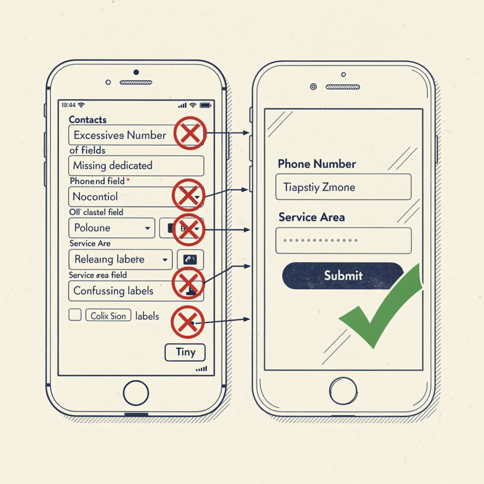
Mistake 1: The form has too many required fields
Name, email, phone, address, service type, preferred date, how did you hear about us, describe your issue, budget range. 9 fields. On mobile, this is a 4-minute form that most people abandon halfway through. The fix: 3 fields only — name, phone number, brief description. Get the call. Ask the other questions by phone.
Mistake 2: No response time expectation set
Someone fills out your form and hits submit. The thank-you screen says "We'll be in touch soon." When is soon? Tomorrow? This week? The customer doesn't know when to expect a call, so they don't wait — they move on while they're still in solution mode. The fix: be specific. "We'll call you within 2 hours during business hours. After hours, expect a call the next morning." Set an expectation you can actually meet, then meet it.
Mistake 3: Submissions go to an email nobody monitors in real time
Form submissions need to trigger an immediate notification — text or push notification to your phone, not just an email to a mailbox you check once a day. Install a form that sends you a text the moment someone submits. If you can call back within 30 minutes, your close rate on web leads is dramatically higher than calling back the next day. The tech for this is simple: most form builders (Formspree, Netlify Forms, etc.) support SMS notifications or can trigger them through Zapier.
Mistake 4: No phone number visible on the contact page
This sounds like a joke but it's real. Some business contact pages have a form but no phone number. The form is the only option. Customers who want to call — and a majority do, especially for time-sensitive requests — have to go back to the homepage to find the number. Put your phone number at the top of the contact page, large, tappable on mobile, before the form. Both options, both visible, no hunting required.
Mistake 5: No service area listed
A potential customer wants to know if you serve their area before they bother filling out a form. If your contact page just has a form with no geographic context, they have to guess — and if they guess you might not serve them, many won't fill it out. The fix: add a brief "Service Area" line above or near the form: "Serving greater [Your Metro] — including [Suburb A], [Suburb B], and [Suburb C]." 10 seconds of reading, zero ambiguity, more form fills.
The contact page checklist
Three-field form with a specific response time promise. Phone number visible and tappable at the top. Service area stated clearly. Form submissions notify you by text within seconds. Thank-you page confirms what happens next and includes your phone number in case they prefer to call now.
A contact page with all five of these things consistently outperforms a contact page missing any one of them. They're all simple. None of them require a designer or a developer — just someone who thinks through the customer experience and plugs the holes.
Ready for a site that converts?
From $199 setup. $49/mo. Live in 3 days. Free mockup to start.
Get my free mockup