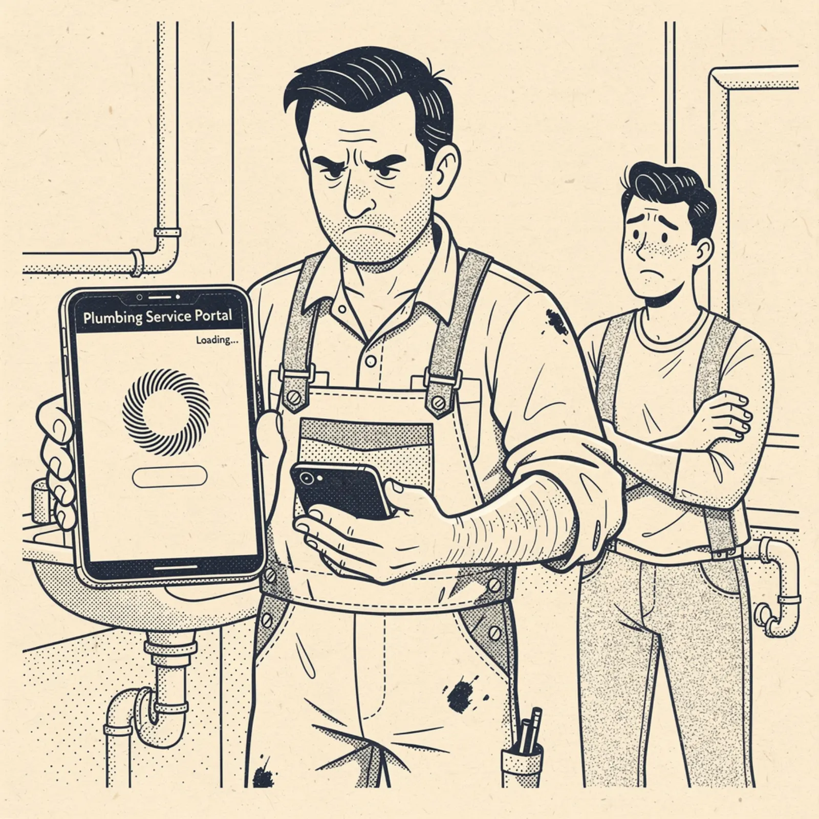
Let me tell you something that probably describes your situation right now: your website looks pretty good on your laptop. You had someone build it, or you did it yourself on a weekend, and when you pull it up on your desktop browser it looks like a real business website.
Now pick it up on your phone. Open Chrome, type in your business name, and pull up your site. Time how long it takes to load. Then look at what you see — can you read the text without zooming in? Is the phone number big enough to tap with your thumb? Does the "request a quote" button appear above the fold, or do you have to scroll three times to find it?
If that exercise made you cringe, you're in the majority. Google's own data shows that 53% of mobile visitors abandon a site that takes longer than 3 seconds to load. The average small business template site loads in 6 to 12 seconds on a phone. Do the math.
The real number: 70% of local searches happen on mobile
When someone needs help at 7pm on a Tuesday, they're not sitting at a desktop computer. They're in their kitchen holding their phone, searching "dentist near me" or "emergency locksmith" or "coffee shop open now." When a homeowner wants a quote after hours, they're standing in their yard with a phone.
This isn't a niche audience or a future trend. It's your core customer, right now, in the exact moment they're most ready to hire someone. If your site doesn't work on a phone, you're invisible to the majority of your best leads.
Here's what 80% of those people experience when they land on a broken mobile site:
- The page starts to load. White screen for 2-4 seconds.
- Text appears but it's tiny — the desktop layout just shrunk down to fit the screen.
- They pinch to zoom in. Now they can only see part of the page at a time.
- They try to find your phone number. It's in the header somewhere but the header is huge and they can't tap the number.
- They give up and hit the back button. Your competitor's site loads in 1.8 seconds and has a big blue "Call Now" button right at the top.
That whole sequence took 12 seconds. You just lost a job.
The six specific failures that kill mobile performance for business sites
1. The desktop-first layout
This is the biggest one. Most small business sites were built for desktop and then shrank down to fit a phone — they were never designed to work on mobile first. The result is a layout where the text is 8pt, the navigation is a row of 12 links that wrap into a mess, and the hero image takes up the first scroll of the page with the actual content buried below.
A mobile-first design starts from the phone layout and expands from there. It means the most important thing on your page — your business name, your service, and your call-to-action — is visible in the first 100 pixels of scroll, every time.
2. Images that aren't optimized
You sent your web person 10 photos of recent jobs. They uploaded them as 4MB JPEGs directly from your iPhone. Your homepage now has to download 40MB of images before it can display anything.
A properly optimized business site serves images as WebP format, at the actual size they'll be displayed, and compressed to under 200KB each. The same images that look great. The page loads in under 2 seconds instead of 12.
3. The phone number isn't tappable
This is embarrassing how often it happens. The phone number is displayed as plain text — not wrapped in an href="tel:" link. So a mobile visitor who wants to call you has to memorize your number, exit the browser, open the dialer, and type it in. Most of them just don't. They go to the next result where tapping the number immediately calls.
4. No click-to-call in the hero
Even if your number is technically tappable, if it's not visible without scrolling, you're losing calls. For any business that handles urgent or time-sensitive requests — a locksmith, an urgent care clinic, a tow service, an after-hours repair shop — the very first thing a mobile visitor should see is a way to call you. Not a hero image. Not a paragraph about your values. A call button.
5. Fonts that are too small to read
Google recommends a minimum font size of 16px for body text on mobile. Most template-built business sites use 12-13px. That means a visitor is zooming in before they've read the first sentence. Once they zoom in, the layout breaks, they can't see full lines of text, and they leave.
6. Slow hosting on cheap shared servers
That $5/month GoDaddy hosting plan puts your site on a shared server with 500 other sites. When any of those sites gets a spike in traffic, your load times go up. The server may be on the other side of the country — the request has to travel before it even starts loading.
Modern hosting on a CDN (content delivery network) serves your site from the nearest edge location to your customer. A visitor anywhere in the country gets served from a nearby data center, not a distant shared server. That alone cuts load times in half.
How to test your site right now (free)
Three tools. Take 10 minutes and run all of them:
- Google PageSpeed Insights (pagespeed.web.dev) — paste your URL, run it, read the mobile score. Anything under 70 is costing you leads. Under 50 is actively hurting your Google ranking.
- Google's Mobile-Friendly Test (search.google.com/test/mobile-friendly) — this tells you whether Google considers your site mobile-friendly at all. If it fails this test, Google is downranking you for every mobile search in your area.
- Your own phone — pull up your site on your actual phone, on your actual cell network (not wifi). Time the load. Try to tap your phone number. Try to find your contact form. Be honest about what you find.
If you're scoring under 70 on PageSpeed, failing the mobile-friendly test, or can't tap your phone number without zooming — you have a real problem that's costing you real money every day.
What a properly built mobile site looks like for a small business owner
Here's what a small business owner needs to have visible on a phone without scrolling:
- Your business name and city (so Google and the visitor know who and where you are)
- What you do in one line ("Family photographer in Austin" or "Emergency locksmith — serving Denver")
- A tappable phone number in large text
- One primary call-to-action button ("Get a free quote" or "Book service")
Everything else — your gallery, your about section, your service list, your reviews — comes after. The visitor who needs you urgently calls from that first screen. The visitor who's researching scrolls down and gets sold by your portfolio and reviews.
Two different visitors, two different behaviors, both served by the same page. That's mobile-first design.
The bottom line
You're probably spending money on Google ads, maybe paying for a Google Business Profile listing. All of that drives traffic to your website. If your site is broken on mobile, you're paying to send people to a place that turns them away. Fix the site first. Everything else gets more efficient the moment the site works.
Want to see what a mobile-first business site looks like?
We'll build you a free one-page mockup of your homepage — properly built for mobile, with your business and your city. Takes about 24-hours. No commitment.
Get my free mockup